Ohtatyaro ©
Matus Kolocik
Intro
Hi, I’m Matúš — a designer and illustrator
with experience in project management.I explore the sweet spot between playful creativity
and practical design. As a versatile generalist, I thrive
on adapting quickly and scaling my work across
a wide range of mediums.
SELECTED WORKS


2024
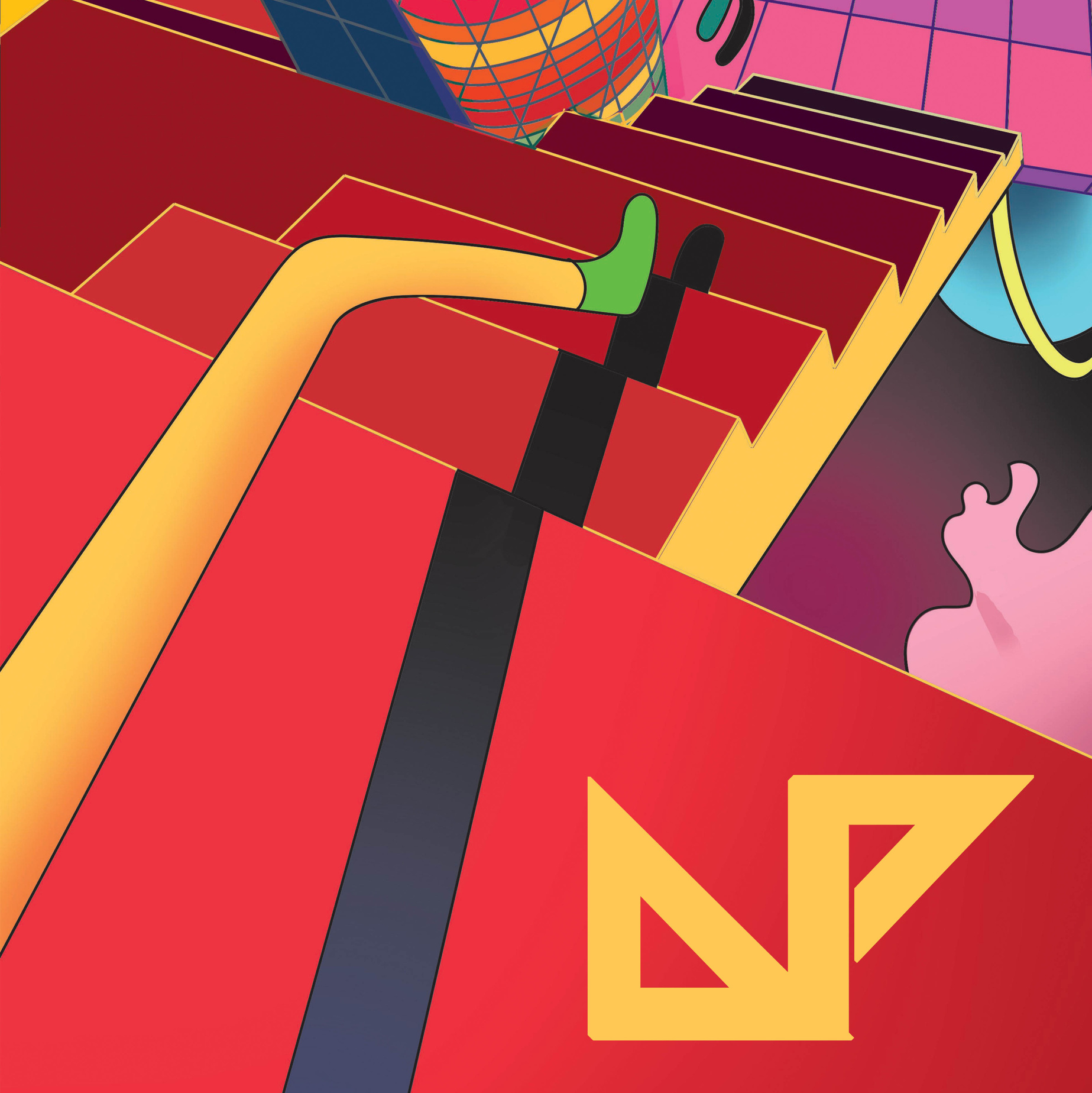
Apeckoviny
magazine layout design
Festival diary with critique and presentations.


2023
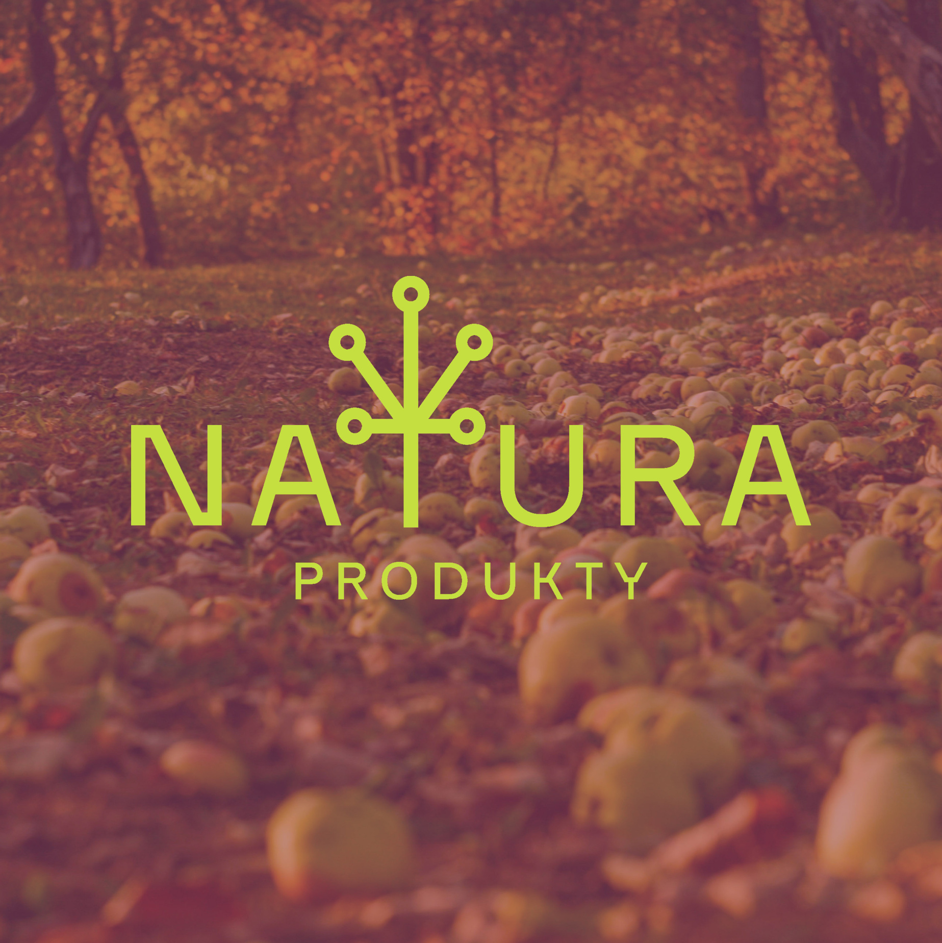
NATURA BRAND IDENTITY
Branding and packaging design for an online shop specializing
in organic products and fresh produce.


Custom illustrations for oatmeal packaging.


2023-2024
REMEA BRAND IDENTITY
Brand identity for a company offering remote measuring
of heat and energy use.


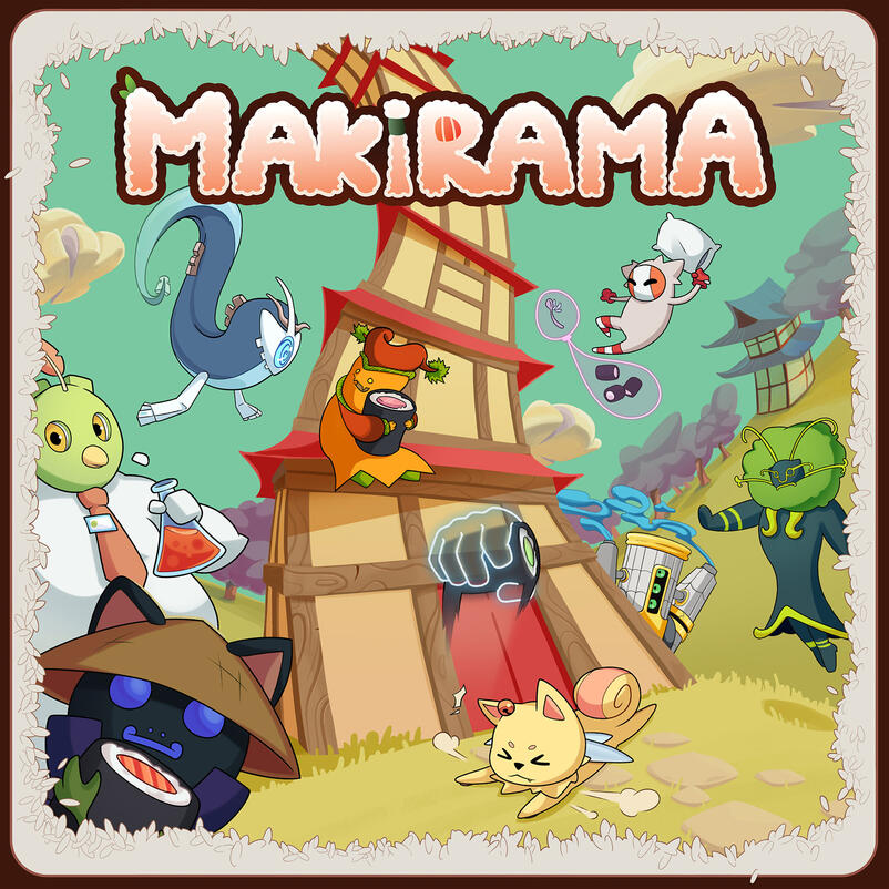
Card design and box art for Makirama,
a board game project with deep lore of surreal creatures by Nereus Games.Makirama is a 3-6 player team-based in which spirimonsters (cute ethereal creatures) try to capture makis, in a world inspired by psychedelic art. They can draw new abilities and have to adapt to (un)lucky events.
2022

card design


At the beginning of my collaboration with AP, I developed illustration-based designs that captured the festival’s playful and youthful character. Following a change in festival management, we transitioned to a more minimalist and refined visual approach. This evolution aligned seamlessly with the dual aspects of my design philosophy: expressive complexity and minimalist clarity.


AP 2022 Billboard DesignIn response to the invasion of Ukraine, we created an illustration that reflected the difficult circumstances faced by Ukrainian students. The characters are shown leaning into a powerful wind, symbolizing their struggle to maintain a sense of normalcy and continue their studies. Their elongated shadows, reminiscent of De Chirico’s work, evoke a sense of isolation and resilience amidst adversity.


2020-2025Digital art
No AI


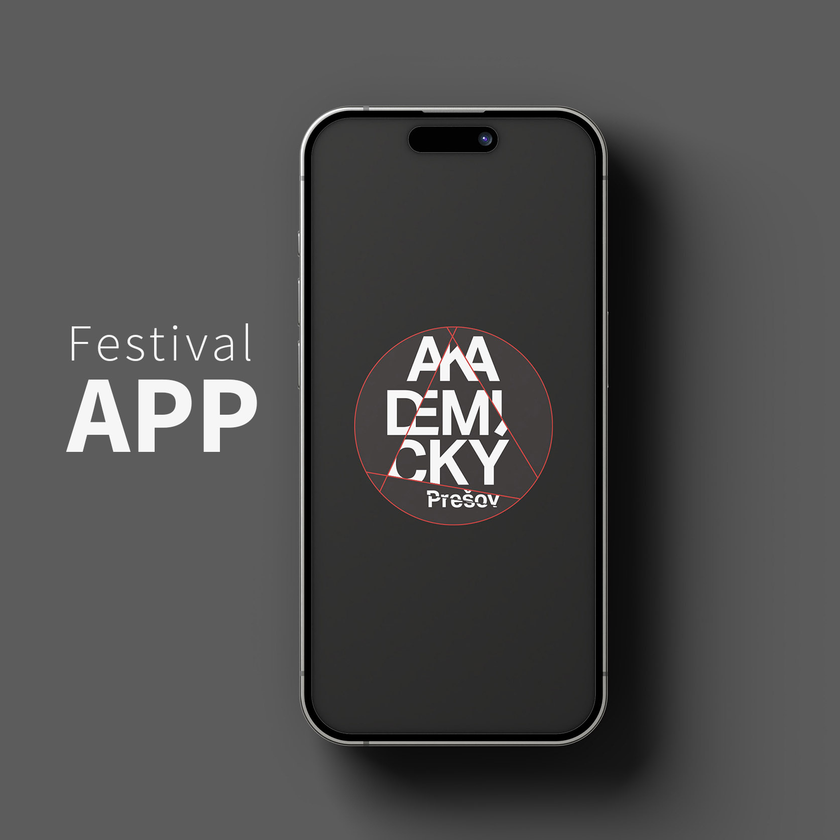
App design

2024-2025
end to end mobile app
AP is one of the oldest academic theatre festivals in Central Europe. With a 60-year history, the management continues to pursue innovation and improve communication strategies with festival visitors. The festival app is by no means rocket science. We encountered several challenges along the way, but overall, we had a clear vision of the desired outcome.
Wireframing


Hifi mockup

.
For this project, we chose to combine Roboto Bold with Brandon Grotesque to create a typographic system that balances clarity, modernity, and character.Roboto Bold is a highly legible, geometric sans-serif that performs well in digital environments. Its clean lines and strong presence make it ideal for headings, menus, and UI elements that require quick readability—especially on mobile.Brandon Grotesque, with its slightly rounded forms and humanist undertones, brings a warmer, more distinctive personality to the design. It’s used for body text.The landing page features a standard opening with a logo transition that smoothly blurs into the homepage, creating a subtle and elegant entry animation. On the homepage, we visually prioritized the main menu, with program highlighted, integrating cross-cut elements of the logo to create a cohesive and recognizable navigation bar. Just above the menu is a news banner that draws attention to frequent program updates. At the top of the page, a dynamic slideshow highlights today’s performances, ensuring key information is always accessible at a glance.

.
Festival programList of performances, workshops and other events.
We introduced a favorite feature using a heart icon, enabling users to mark specific performances. Once selected, users can filter the program to display only their favorited shows—supporting a more personalized and efficient browsing experience.
To enhance user navigation, we implemented four sorting options for the event list: Show All, Today’s Performances, Sort by day, and liked performances. This allows users to quickly tailor the program view to their interests or schedule.
Visitor also has an option of rating the performance, which could be taken into consideration by judges and also can serve as a feedback for organizers.


.
Map and merchUtilizing the same sorting options as the event list, the map screen serves as an efficient tool—designed primarily for city visitors and theatre groups. Users can click on an arrow next to a venue to scroll through all performances scheduled at that location, making it easy to explore what’s playing where. They can also choose if they need to navigate to the spot.
Merch serves only as an ad, not as a build-in shop. All of the merchandise can be bought at the events.


.
TextsThis section offered a great opportunity to showcase works by students who won last year’s AP literature competition. We included it to highlight emerging young authors and add literary depth to the app. For instance, someone waiting for a performance might browse through and discover these texts—turning idle time into a moment of engagement.
We also added logo in the right corner which serve as a home button.


.
Team and partnersFinally, an obligatory section of sponsors and festival staff together with judges of different categories.


poster & graphic design


2025
Literature evenings project visuals
The literature evenings project is an exercise of clean visuals guided by typography and monochrome colors.


2023
online shop design for a artisanal cake company
This project was halted midway through, and remained in the draft stage ever since. I decided to show it here temporarily. I completely underestimated the depth and complexity involved in designing a webshop for an artisanal cake company. The client was adamant about giving customers full control over every aspect of their cake, requiring a highly detailed and customizable ordering process.
6 steps process
The simplest flow I identified is a six-step process in which the customer purchases a bestselling cake. The steps are: selecting the type of cake, number of layers, one of three bestsellers, delivery date, number of servings, and optional toppings. It’s hard to imagine a more streamlined process for buying an artisanal cake.

11 steps process
The most complex flow I encountered was a 11-step process for ordering a layered custom cake. The steps included: selecting the type of cake, number of layers, type of bottom layer, bottom layer filling, additions to the filling, type of upper layer, upper layer filling, additions to that filling, toppings, delivery date, and number of servings. It’s a long list of choices—and a real challenge from a design perspective.

Wireframing

UX
User Insight
We discovered that many customers appreciated the ability to craft a meaningful, personalized gift. However, too many visible options at once caused overwhelm and decision fatigue.UX Strategy
To make the process feel lighter and more engaging, I broke it into micro-decisions, keeping the user in control without flooding them with choices.For example:Step 1: Hovering over the "Orders" button reveals a banner with cake categories.Step 2: Clicking a cake opens a small icon-based popup to choose between a simple or layered cake.Both steps happen without leaving the homepage, making the start of the flow feel seamless and natural.We applied a similar principle to the bestseller cakes, cheesecakes, and candy bars by using popup windows. This approach helped minimize the feeling of being constantly redirected to a new page, maintaining a smooth and focused user experience.
11 steps
menu
UI
UI Approach
Used progressive disclosure: information is shown only as needed.Prioritized clean visuals and icon-based interactions to simplify complex steps.Another challenge was how to present ingredients in a way that didn’t rely on customers recognizing or visualizing them just by name. We considered using image popups triggered on hover, but since the site must be optimized for viewing on phones too, we ultimately chose to display each ingredient visually by default. This approach made the selection process more intuitive and visually engaging, especially for users unfamiliar with certain ingredients.


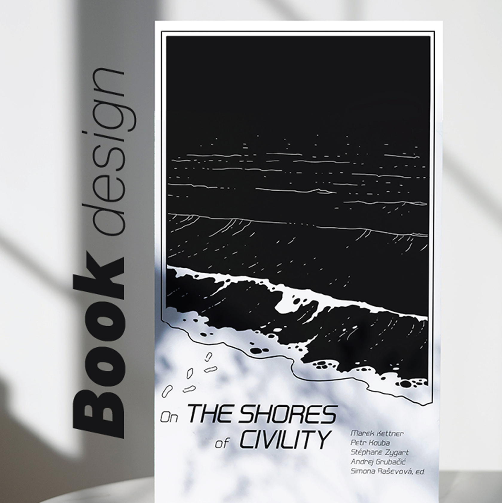
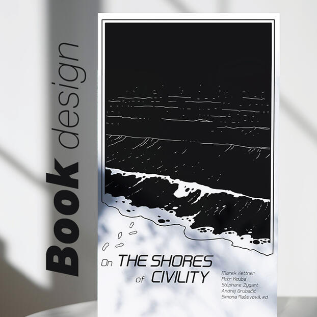
2020-2025BOOK DESIGN
BOOK LAYOUT
In my freelance career, I’ve had the opportunity to design
cover art and layouts for beletry and academic publications on theatre theory and philosophy. All the illustrations are done by hand, without the use of AI.


2020-2025
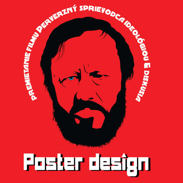
POSTER DESIGN
Visuals for philosophy educational events, movie screenings and music events
organized by NGOs and academic institutions.


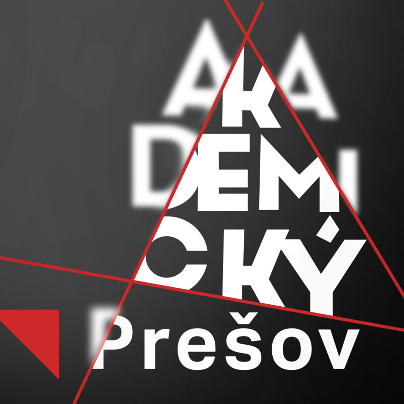
2023-25
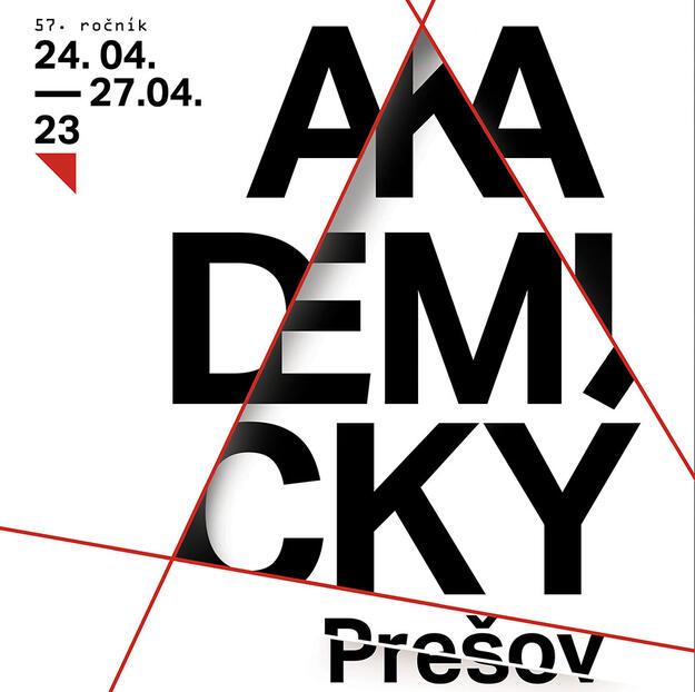
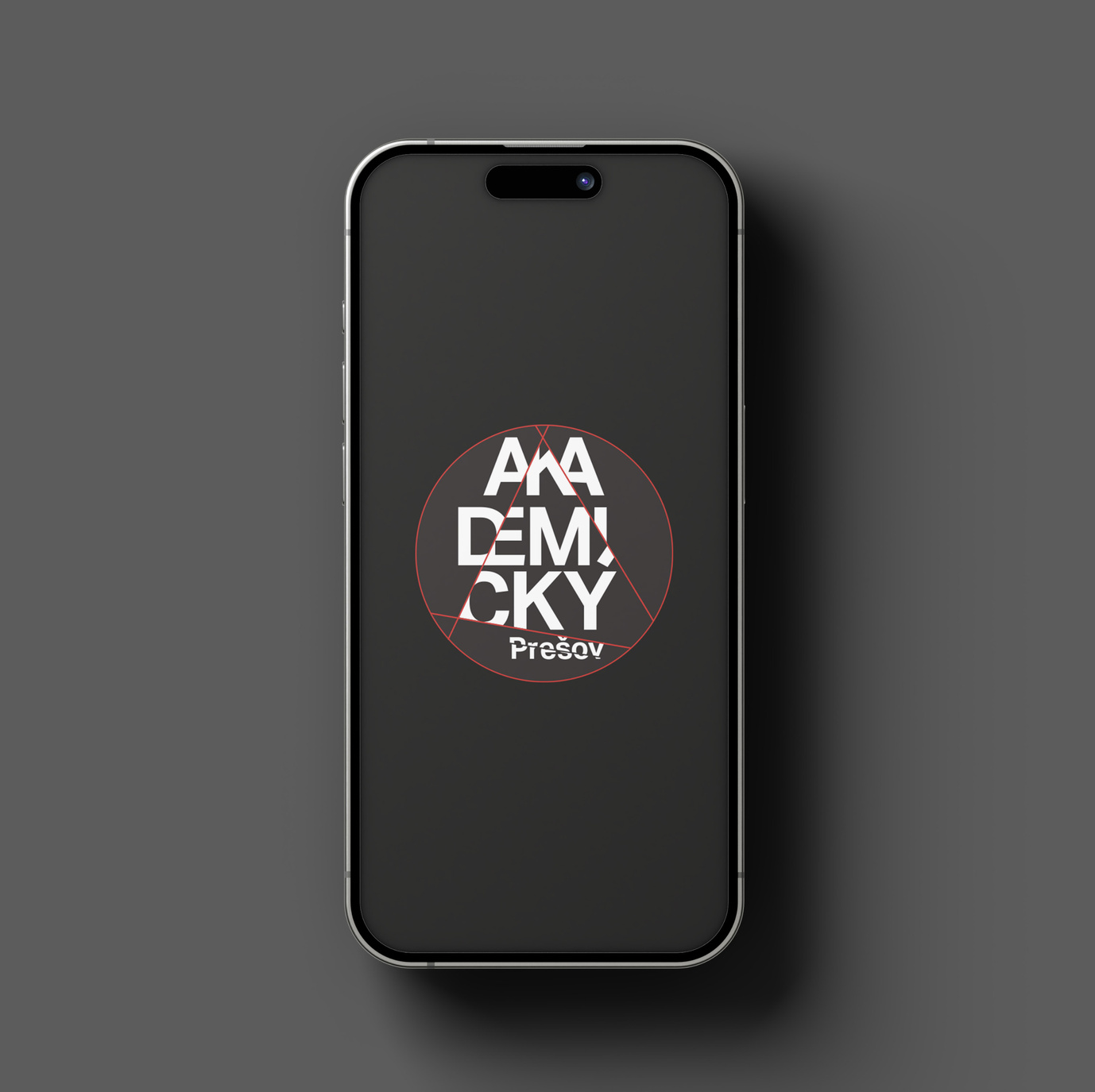
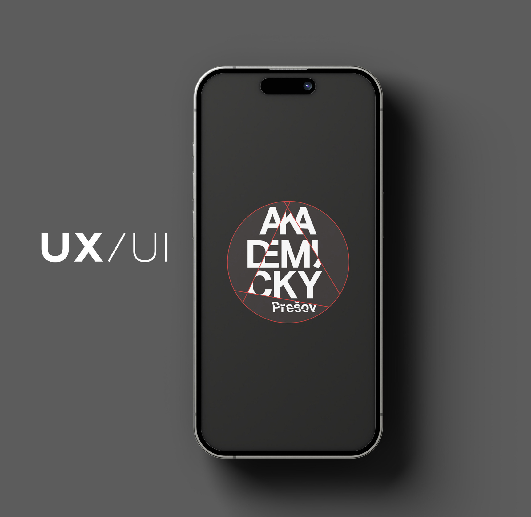
AKADEMICKY PRESOV
FESTIVAL IDENTITY DESIGN
I have the privilege of creating the visual identity year after year for the international theatre festival "Akademicky Presov". AP is a festival of professional theatre and also competition of amateur artistic creativity of University Students in Slovakia. AP has 59 years history, making it one of the oldest academic theatre festivals in central Europe.
LOGO AND POSTER DESIGN


banners and billboards DESIGN
I created multiple variations of banner visualizations tailored to different platforms, including digital displays, social media, and large-format prints, while maintaining a consistent visual identity. This example includes the billboard design along with a curated selection of accompanying banners.
The following year, I introduced a new typeface—distinct yet still aligned with the brand’s core identity—to enhance visual differentiation. I also experimented further with shapes and composition


Program & merch
Crucial part of the festival identity is also "Apeckoviny" a bulletin with a commentary and reviews of performances. Program design is always tricky, because there are changes in lineup until the last minute.


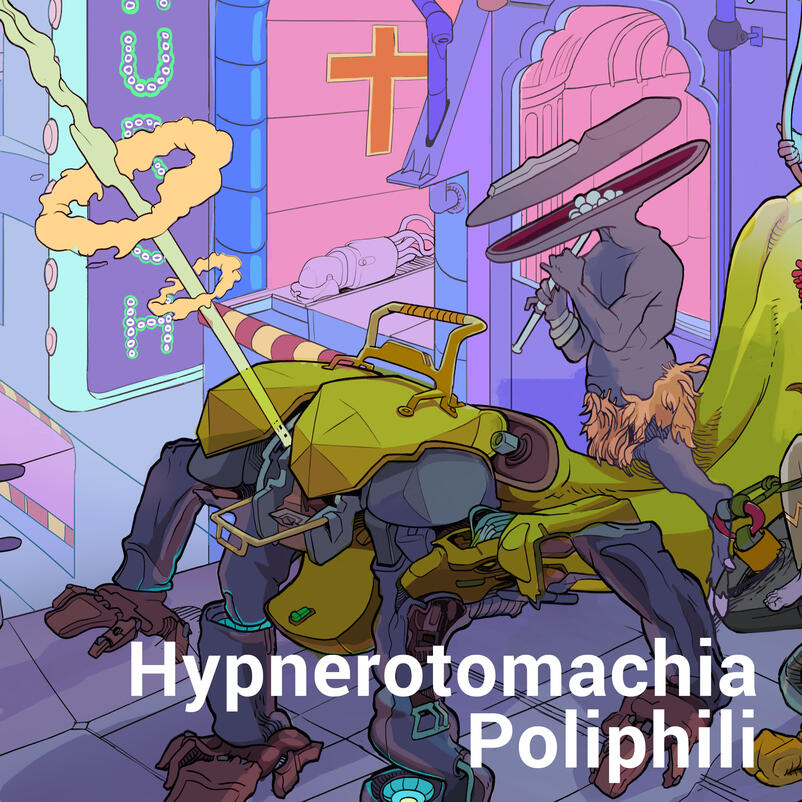
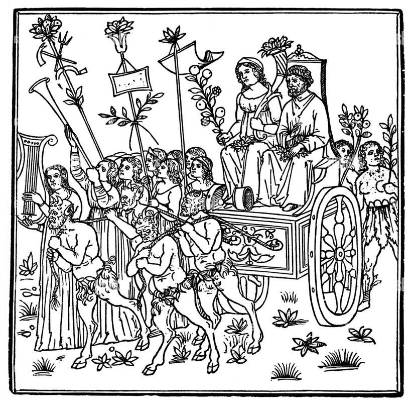
Hypnerotomachia Poliphili
2023
A personal interpretation of a illustration from incunable
Hypnerotomachia Poliphili, printed in 1499 in Venice.
The book presents a mysterious arcane allegory in which
the main protagonist, Poliphilo, pursues his love, Polia, through
a dreamlike landscape.

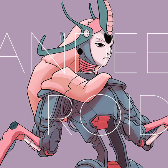
Andeeroid
2025
Andeeroid and his robotic friends.
I explored the four legs movement patterns

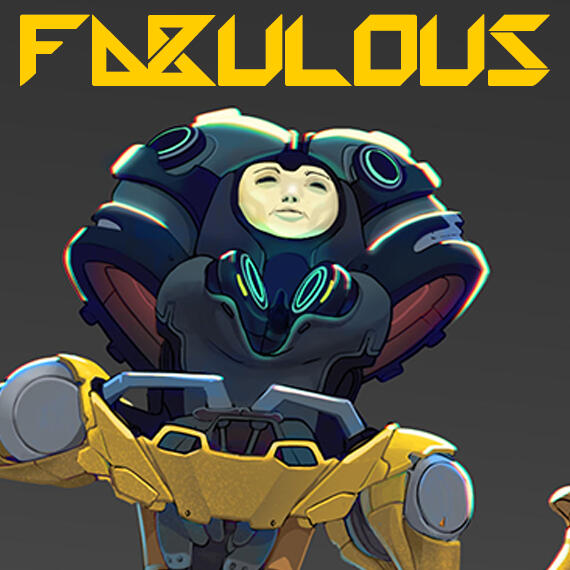
Fabulous
2025
Concept art for an android project

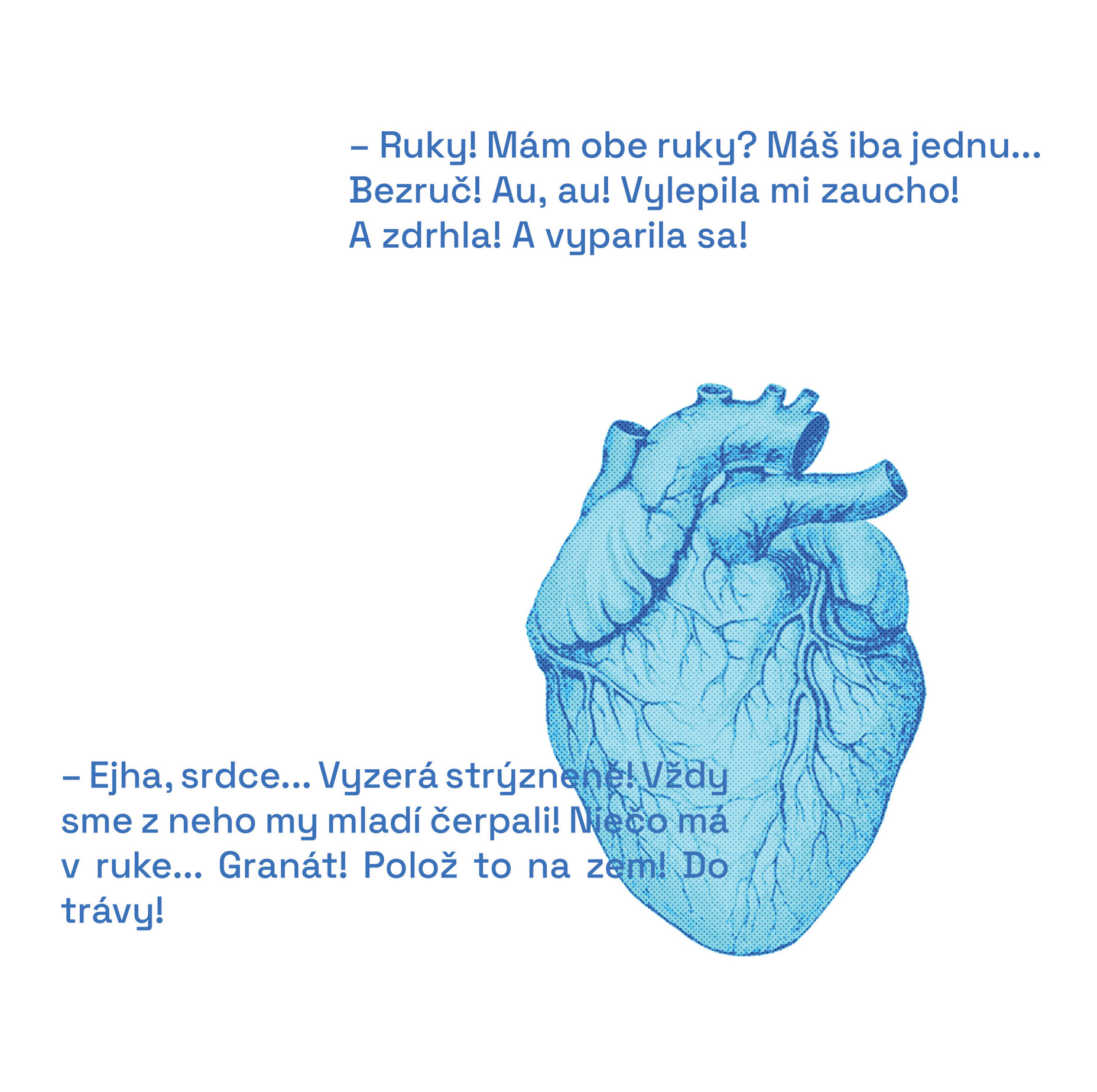
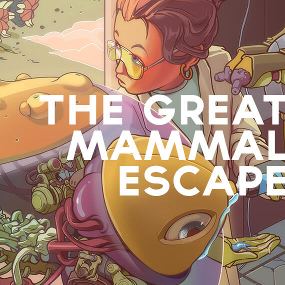
The great mammal escape
2025A scene depicting a dynamic, enclosed food production system. The lab specializes in the rapid production of mammalian milk and meat, made possible by an innovative technology that incubates the mammal core. The entire hardware ecosystem consists of a mammal core, a removable head, an incubator, and a milking/feeding unit. Occasionally, a 7-day-old mammal escapes its scheduled termination. No worries—it’s just a blind, deaf creature with no sensory perception.

From lineart to basic colors,
the design went through some basic changes.

A final polished depiction of the feeding of the three-day-old mammal and its escaped sibling
About
About meI’m a graphic artist and illustrator with a diverse skill set spanning video editing, book cover and poster design, graphic design, character design, concept art, and surreal imagery.
With experience working closely with NGOs, corporate clients, and startups.
I also have this exotic hobby of reading books.
Education2003 - 2007 Secondary school of arts
Vodárenska 3, Prešov, graphic design2007 - 2011 Academy of arts, Banska Bystrica
faculty of visual arts, graphics
(achieved title: bachelor)2011 - 2013 Academy of arts, Banska Bystrica
faculty of visual arts, liberal visual arts
(achieved title: Master of arts with honors)2013 - 2017 University of Prešov
Institute of philosophy,
subject field: systematic philosophy (PhD. level)2017 Lehigh University, PA, USA
Dpt. of philosophy, under prof. Gordon Bearn
ExperienceCo-founder & Event Manager
NGO NAPLNO
Feb 2015 - present
-public debates, cultural heritage, book publishing
-Fundraising, organization of workshops, discussions, lectures.Lead graphic designer
Theatre festival Akademicky Presov
May 2019 - PresentFreelance Graphic Artist & illustrator
Self-employed
Feb 2021